Location : Los Altos, CA, United States
Industry: Behavior Analytics
Role: Product Designer
Visit Auryc Website →
TL;DR
The engagement with Auryc's session replay was not as expected, I took action to discover what was wrong and improved the experience in the feature.
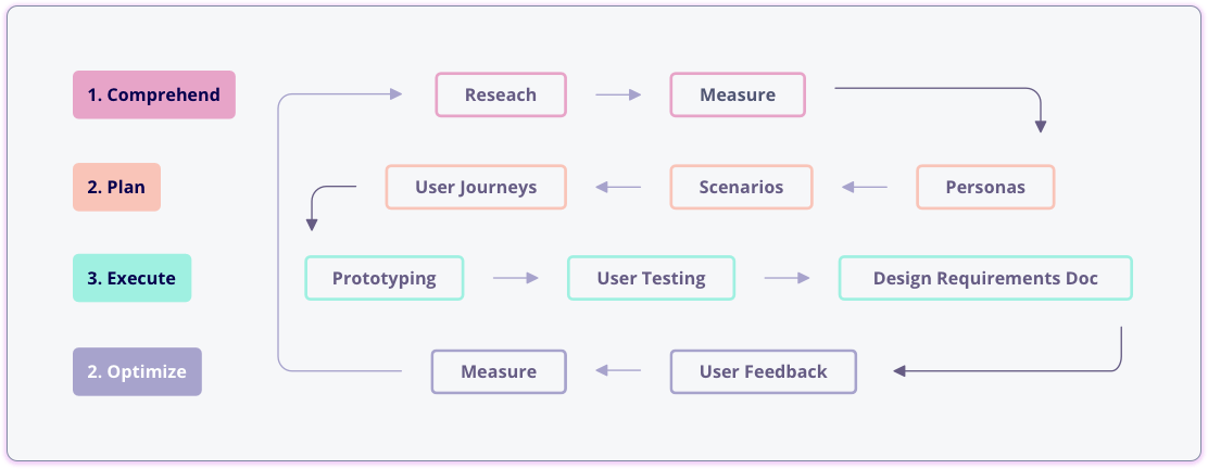
Comprehend the Situation
Auryc is a customer experience (CX) Analytics platform which by only adding a simple javascript library to your website, you can track visitor behavior to find and resolve journey issues. One of Auryc's solutions is Session Replay, where you can watch true-to-life recordings of your customer's journeys.
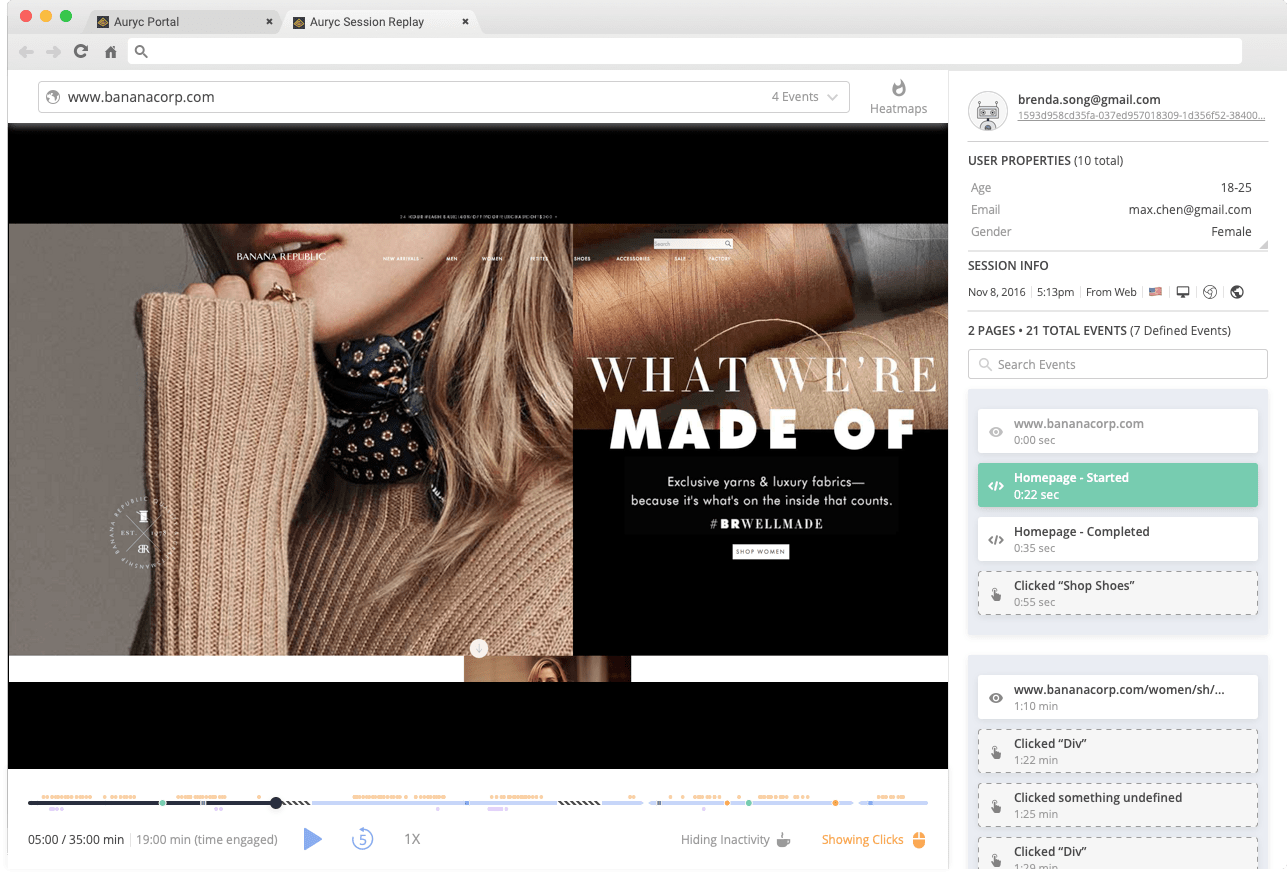
We discovered that 8 of every 10 customers that logged-in to the portal watched at least 2 replays, this was huge! but we also detected that the engagement with the components of the replay UI was low.
Plan
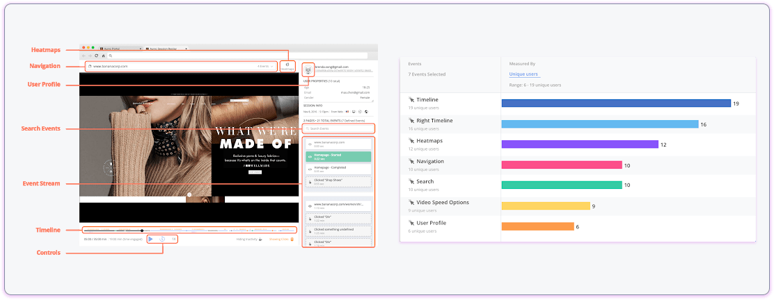
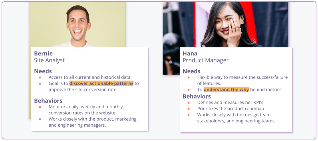
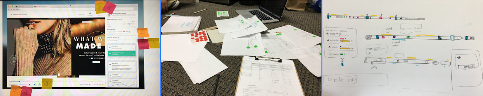
I analyzed visitors' behavior using Auryc (some kind of ice-creaming inception) where I tracked event performance(e.g. click rate of a particular button) and watched meaningful session replays. This gave me the context of our visitors' usage patterns, followed with a couple of 1-1 user interviews which helped me to define personas that could benefit by improving the interaction.
With all the research, the whole team bounced some ideas, we voted and picked the most interesting, allowing me to delimit the scope of this improvement in two important goals:
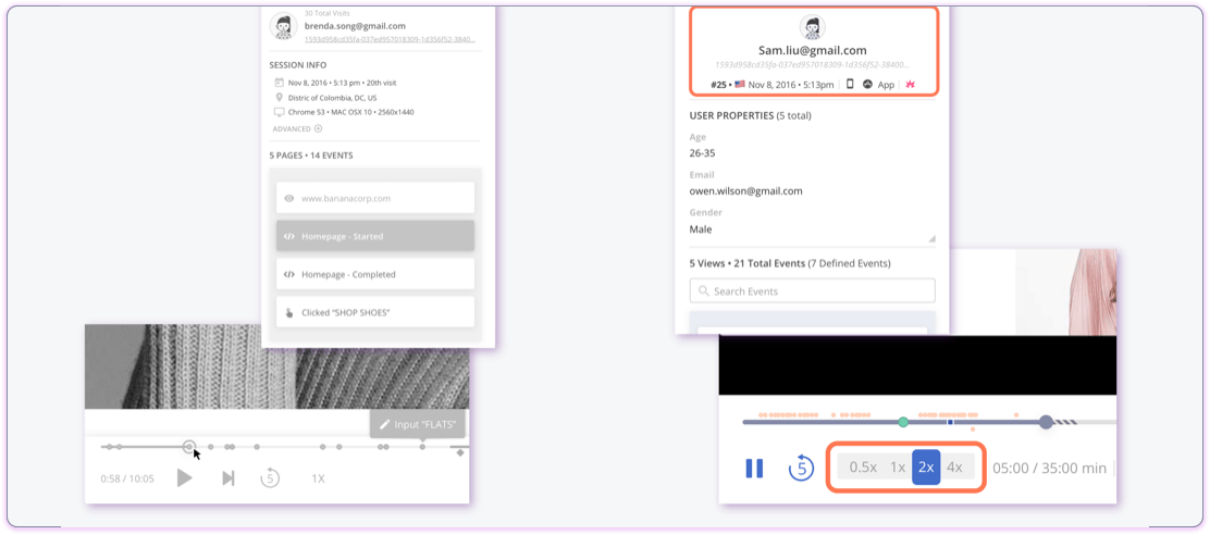
- I discovered some of the components of the Replay UI were misleading, so the first step was to optimize button consistency and unify behavior across the platform.
- People was interested in making easier to share meaningful sessions with their teammates…
Design & Execute
I sketched the user journey based on the idea of allowing our visitors to share replays, which then evolved to an idea of allowing visitors to write notes in a replay, anytime they are watching a user journey. Then I created HD Prototypes in Sketch and used InVision to share the proposed interactions. I also wrote a Design Requirements Document which describes the prototype to an atomic level, from the smallest component to the biggest interaction across user paths.
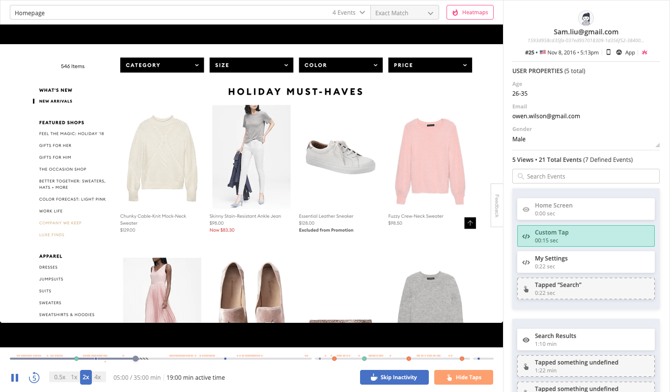 First iteration
The first implementation improved greatly button contextuality, making them more differentiable.
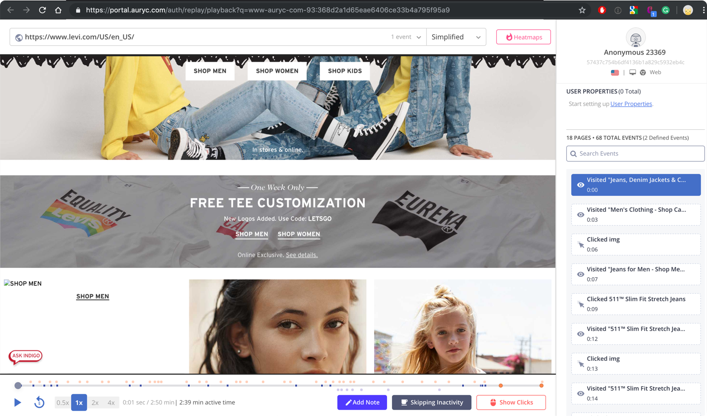 Final version
The second release included the notes and sharing feature.
Key changes:
- New feature: Session replay notes & sharing, they can now share relevant sessions via email and mini-URL.
- Customers can filter sessions with notes.
- Button behavior unification across the platform.
- Updated color palettes for better contrast.
Optimize
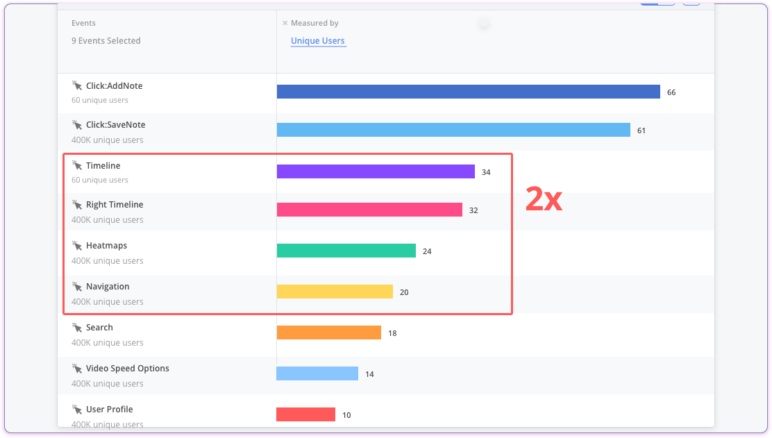
I highly believe that in order to improve something you should be able to measure it, and in this case after a few weeks of deployment I analyzed user behavior with the new changes discovering some great news, usage within the replay components went almost twice as before the optimization, and even better, the notes feature was greatly received with our customers.
Conclusions
- With the idea of unifying the components, We started thinking about creating a small and sustainable design system, which as now is in the works!
- This exercise also allowed me to propose a new approach with our color guide in CSS by creating the first set of CSS Variables which we widely use across the platform now.
Toolkit:
Behavior Analytics, Session Replay, customer interviews, design thinking, Sketch, InVision, Sendgrid, CSS.